A website that works for the artist
Sanchä, DJ and producer
30 s for the summary6 min for the full case
In 30 seconds
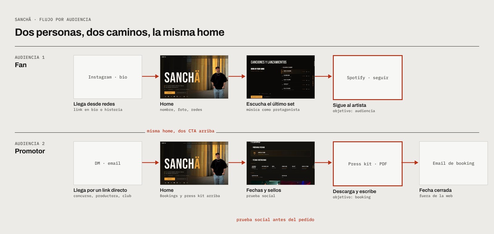
As an artist I needed my website to do more than look good: sell my act to promoters, get more streams and build my own contact list. I designed it as a product, with two audiences, measurable goals and a different path for each. Fans and industry come in through different routes and leave their details for different reasons.
- 2
- audiences, each with its own journey
- 2
- calls to action to capture contacts
- 4
- goals measurable with GA4 and Clarity
The problem (seen from the inside)
Being user and designer at the same time has an advantage: the pain points are your own.
- Reaching labels and event companies depended on sending loose links by message.
- When I had news (a release, a gig) I had no list of my own to tell: everything depended on each social network's algorithm.
- My music was spread across several platforms, with no place that pushed people to listen, add it to playlists and follow me on Spotify.
- I didn't know who was looking for me or from where.
Goals
- Sell the artist: positioning and professional value.
- Get more streams: the most important thing for an artist.
- Build my own database of fans and industry.
- Measure usage to improve the site with real data.
Audiences and journeys
| Audience | What they want | What the site gives them |
|---|---|---|
| Industry: promoters and event companies | Book, evaluate the act | Bookings and press kit at the very top, featured gigs, labels, "Supported by", technical rider, press folder |
| Industry: DJs and labels | New music to play or release | Catalogue by label, link to Beatport, CTA "I want access to the IDs" |
| Fans | Listen, hear about gigs | Latest release with a player, a selection of tracks, video sessions, CTA "I want to know the upcoming dates", Expanded Minds community |
Design decisions
- Two calls to action depending on the audience, instead of a generic "subscribe". A fan and a DJ don't leave their email for the same reason: one wants dates, the other wants unreleased tracks. Separating them means each one gets what's useful to them.
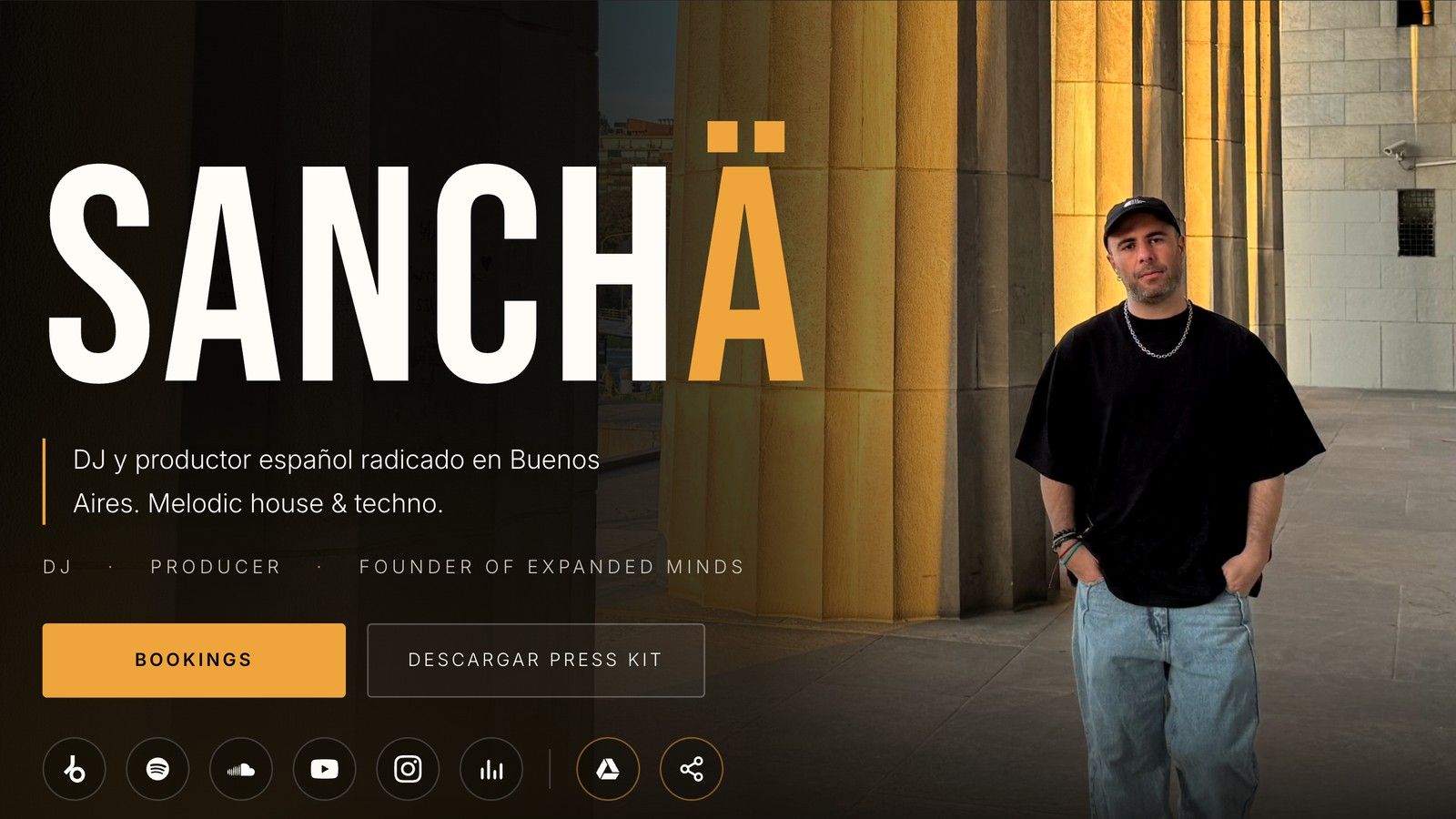
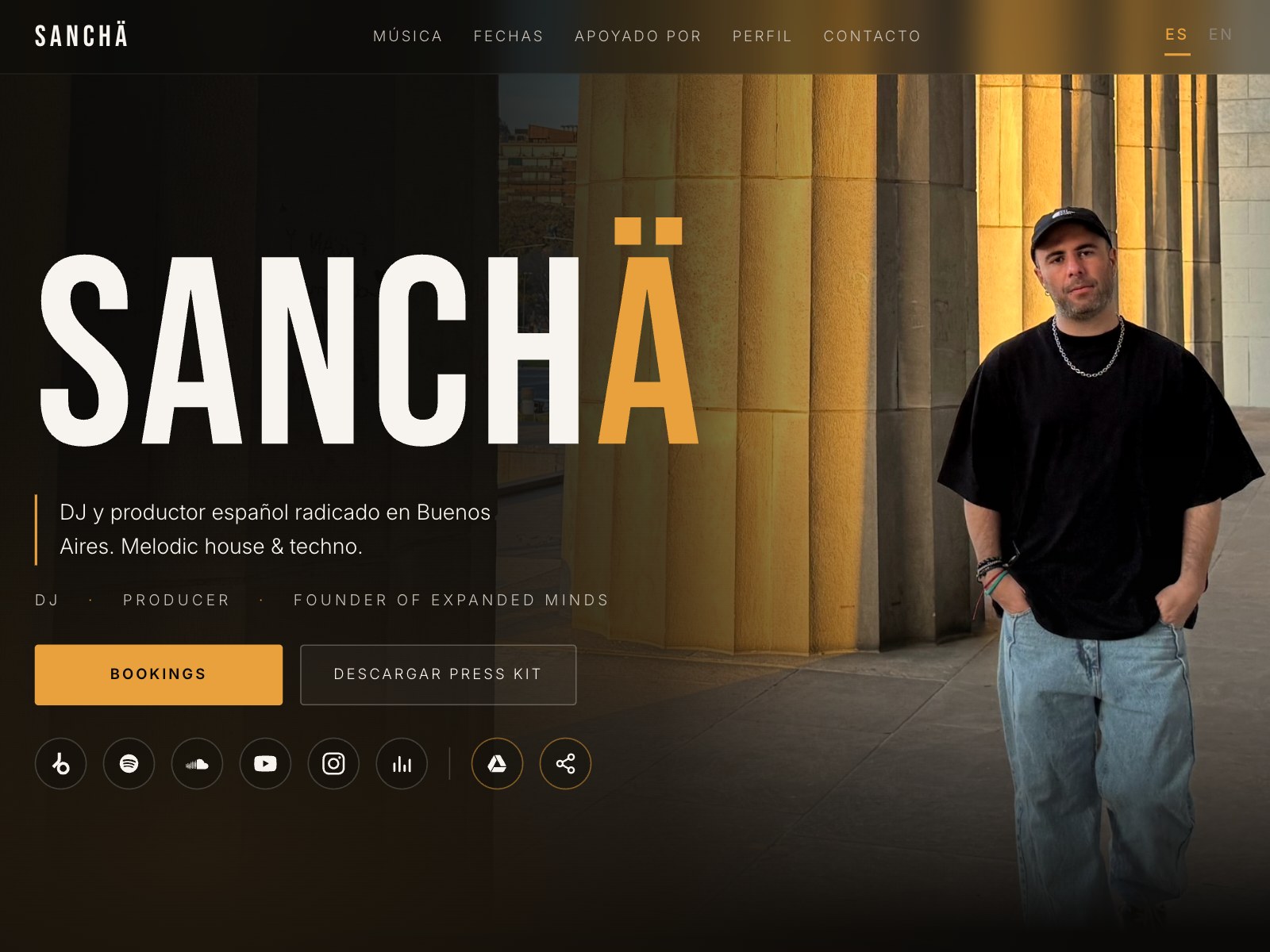
- The professional side above the fold. Bookings and press kit are the two main buttons in the hero, because a promoter decides in seconds.
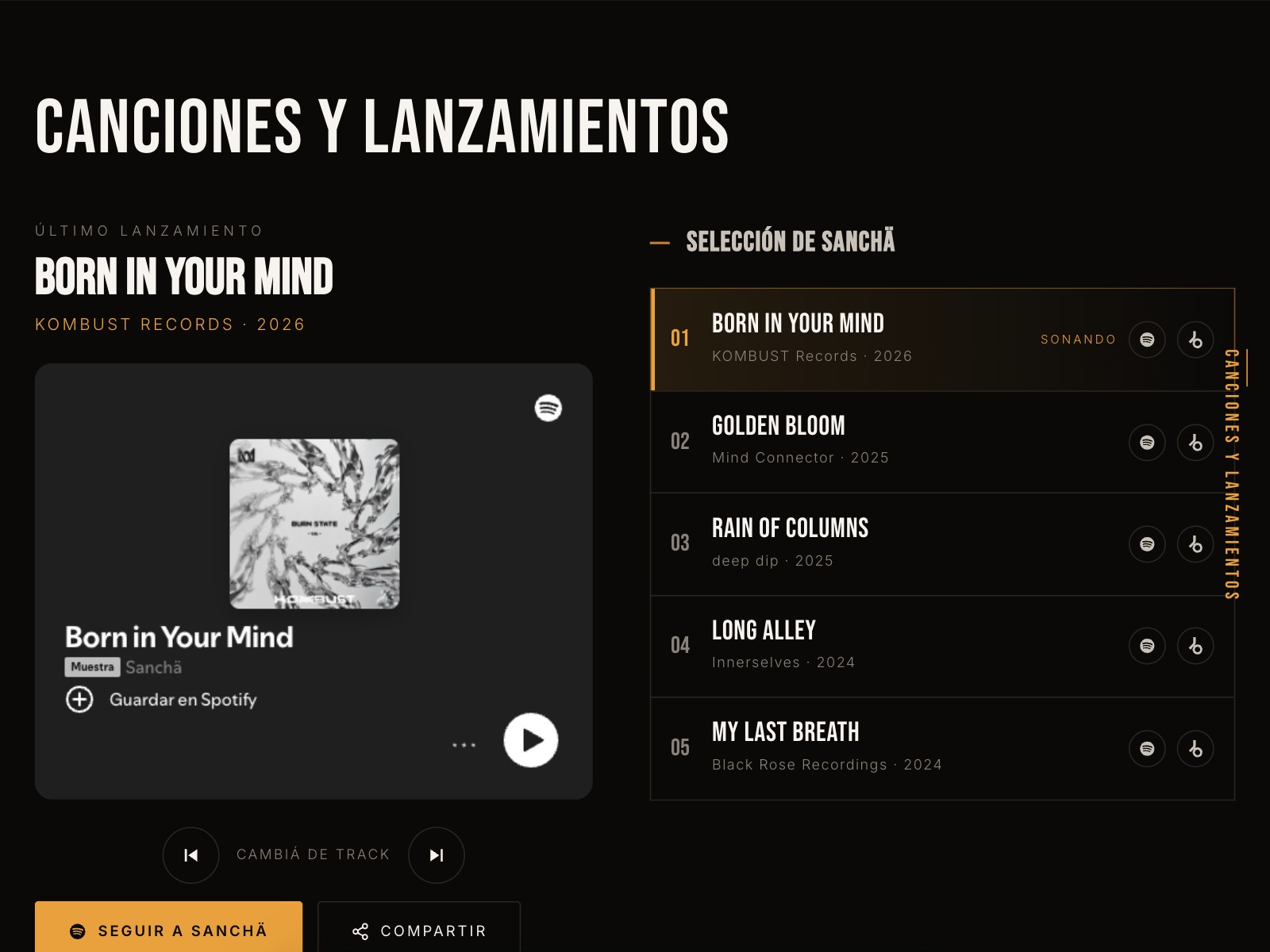
- Music as the protagonist. The latest release with a player and a "Change track" button, plus the selection, push people to listen without leaving the site. Following and sharing are one tap away.
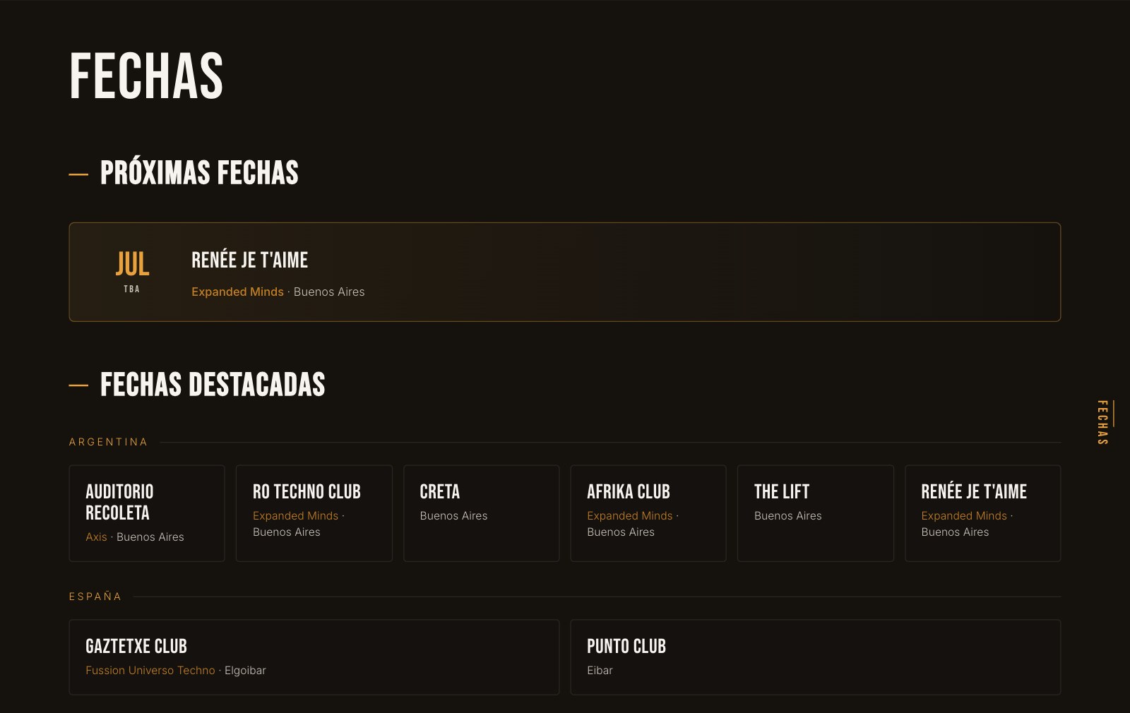
- Industry social proof. Labels, gigs at clubs in Buenos Aires and Spain, and artists who played my tracks: what a promoter wants to see before booking.
- My own automatic database. The forms save contacts in a spreadsheet on Drive. It's a minimal, free CRM that lets me share news without depending on social networks.
- Responsive and bilingual (ES/EN): people browse it on their phone from an Instagram link, and it works for labels abroad.
- Measurement from day one: GA4 to see where people come from and which sections they use, Clarity to watch recordings and heatmaps, and a cookie notice to comply with privacy rules.
Directions explored
For the first screen I pushed three ideas to the extreme and kept the best of each:
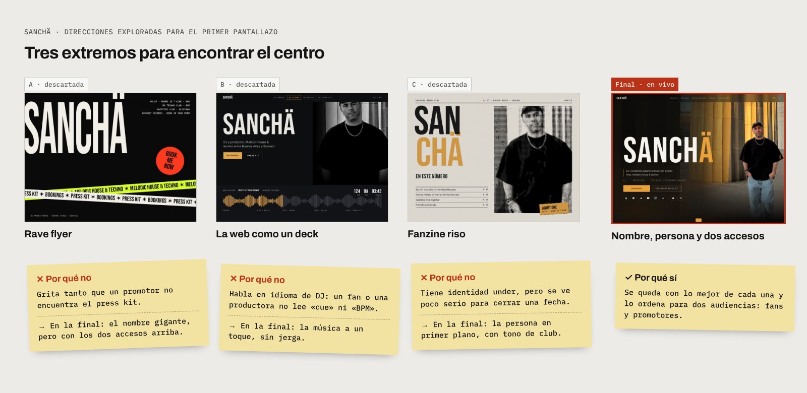
- A · Rave flyer: the giant name, ribbons of text and a "book me now" sticker. It has all the energy of the night, but it shouts so much a promoter can't find the press kit. I kept the giant name.
- B · The site as a DJ deck: navigation is a waveform with its markers, like on a DJ player. It's original, but it speaks DJ language: a fan or an event company doesn't read "cue" or "BPM". I kept the music one tap away, without jargon.
- C · Riso fanzine: the cover of a fanzine printed in two inks, with contents and an intro. It has an underground identity, but it looks too casual to close a booking. I kept the person in the foreground.
- Final: the big name over a real photo, with the two entry points the industry looks for (bookings and press kit) and social links one tap away.
Results (honest)
- It does its job when there's distribution. When I shared it in a contest for a slot at a party and with owners of event companies, they came in and browsed several sections.
- Overall traffic is still low. The data points to the artist's promotion strategy as the issue, not the design: the site is the tool, but people have to be brought to it.
- Next step: a custom domain, which builds trust with the industry.
Learning
A product doesn't replace a distribution strategy. Designing the funnel is half the job; the other half is bringing people to the top of it.